usability
design
Consider the Beer Can
In 1964, John Updike bemoaned the arrival of the modern beer can, offering food for thought to designers who would disrupt familiar experiences.
usability
Notification System Design (99+)
Quora designer Henry Modisett shares perspectives on the unique challenges of designing effective, respectful notifications.
touch
How We Hold Our Gadgets
An excerpt from Josh Clark’s book Designing for Touch explores how we grip different devices, revealing the ergonomic demands of touchscreen interfaces.
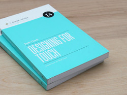
books
Designing for Touch
Josh’s latest book hands you the best design patterns and interactions for modern interfaces.
touch
Touch Means a New Chance for Radial Menus
Radial menus are suddenly in vogue, but it’s not just passing fashion. For touch, this is good interaction design.

buttons
With iOS Buttons, Know Your Right from Your Left
Back! Done! Cancel! Save! Mobile apps sport a bevy of buttons to dismiss a view, but their proper placement isn’t always obvious. Here are the general rules to follow.
advertising
QR Codes Are Footnotes, Not Ads
Go figure, but pulling someone through a QR code means we have to give people information they actually want or need.

gestures
Gestures in #NewNewTwitter
Big changes are afoot in the new Twitter app for iPhone, with both good and bad things happening with the app’s gesture interactions. Here’s a hard look.

ipad
Suzanne Ginsburg on the "Evolution of Discoverability"
Touchscreens introduce new interface metaphors, as well as new techniques to subtly help our audiences understand how to use our apps. Suzanne offers some useful examples.

iphone
Touchscreen Misdirection: Your Metaphor Is a Dog
A touchscreen app can provide useful hints about how it works by using a real-world gizmo as its interface metaphor. But when that gizmo is just eye candy, those hints are just misdirection.
conference
For Your Consideration: Tapworthy iPad Apps at SXSW
Got a second? I need your vote to share my ideas about iPad app design at SXSW. If you’re curious about mobile and tablet app design, you’re gonna dig this talk.
accessibility
How Big Is Big Enough?
O’Reilly Answers recently posted an excerpt from Tapworthy about the ideal size of iPhone tap targets.
iphone
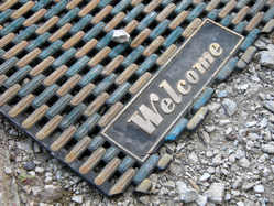
Graffiti Compasses, Welcome Mats, and the Art of the Generous Greeting
Web and software designers, take note: Spray-painted compasses in New York illustrate how helpful a thin layer of extra help can be for new arrivals.
ipad
Quick Thoughts on Designing for iPad vs iPhone
I had a fun conversation with O’Reilly Online Managing Editor Mac Slocum about the differences designing for iPad vs iPhone.
c25k
Vote Early and Often: My SXSW Talks
Got a second? I’m pitching talks for SXSW Interactive about delightful iPhone apps and playful fitness technology—and I need your vote.
community
Winning the Uphill Battle
Paris solves a problem with its bike-sharing program by turning hill-climbing into a game.
business
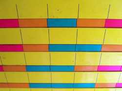
Follow the Grid, Skip the Lines
My post office features a clever heat-map grid to announce slow and busy hours. A perfect idea for the web.
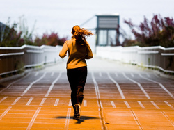
c25k
No Pain, No Pain: The “Couch to 5K” and Humane Design
I wrote the “C25K” training program for new runners over a decade ago. Its philosophy overlaps neatly with my philosophy of software design.