Graffiti Compasses, Welcome Mats, and the Art of the Generous Greeting
By
Josh Clark
Published Jun 29, 2010
Love this. Seems an anonymous do-gooder is making some guerrilla usability improvements to the New York subway, spray-painting compass points outside stations to help emerging passengers get their bearings. NYC the Blog has the details along with photos.

It’s a simple solution to a common problem, how to ease the blinking confusion of disoriented straphangers arriving at a new station. Web and software designers oughtta have the same consideration for their own audiences. In Tapworthy, I recommend that iPhone designers add a welcome mat for newcomers, a thin layer of extra help to point the way for first-time users.
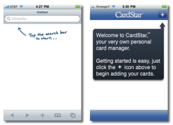
This is especially important if the first screen of your app would otherwise start out empty. A blank screen is disorienting—it’s just old-fashioned manners to offer instructions for getting started. For example, Wikipedia reader Articles displays nothing at all until you search for your first article. Likewise, CardStar is an app that manages chain-store membership cards, but there’s nothing to see before you add your first card. Both apps add welcome mats to these empty screens with quick notes pointing out what to do first.

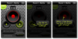
An extended version of the welcome-mat technique can take the audience by the hand to lead them through an unfamiliar concept. Backwords is a fun iPhone parlor game that’s tough to explain but simple to play after you run through it just once. Here’s the gist: one player records a secret phrase on the microphone out of earshot of the second player. When the second player returns, the app plays the word backward, a distorted and unidentifiable sound. The second player has to mimic that jumbled sound, growling and chirping into the microphone. (This is generally hilarious.) Finally, Backwords plays that attempt backward and, if the second player did a good job, it sounds somewhat like the first player’s original phrase. Score a point if you can guess the original phrase.
Whew. The Backwords gameplay is a case where showing is better than telling. “We had these Backwords parties every weekend during development, and nobody ever wanted to read the instructions during a party or when it was their turn to play,” says developer Shadi Muklashy. “They just looked around the room: ‘All right, what do I do?’” To help, he added an optional overlay that gave instructions at each step. A big, casual handwritten font keeps the vibe friendly, with the effect of a game show emcee taking you through every stage of the game. Once you’ve got the hang of the game, a setting lets you turn the instructions off.

Sure sure, in a perfect world your app is so easy and intuitive that it’s immediately obvious to everyone exactly how the thing works. But even the most well-designed interface can benefit from a few introductory hints, particularly for more complex features or tasks. A welcome mat, like the subway compass, is an easy way to offer reassurance and a generous greeting to new arrivals.


