Grids, Design Guidelines, Broken Rules, and the Streets of New York City
By
Josh Clark
Published Jul 10, 2012
What do the streets of New York City have to do with web and graphic design? For better or worse, the grid.
I finally made my way this past weekend to “The Greatest Grid,” a terrific exhibition at the Museum of the City of New York. The show traces the evolution of New York’s grid street system. I came away with a new appreciation for the ambition and willfulness of the city’s design—but a fresh skepticism for our own rigid adherence to grid design on the web and elsewhere.

Our Story Begins in 1811
That’s when New York’s commissioners outlined a brazen plan to extend the city north from 14th street. They drew streets and avenues across the island without regard to its rugged landscape. And they went big: 155 east-west streets slicing up Manhattan across 12 north-south avenues.
The city grid wasn’t New York’s invention. “The grid was the default approach of surveyors to laying out land: it was logical, repetitive, uncomplicated, and facilitated land division,” the exhibition curators explain. It was an urban pattern that was useful to empires as far back as Rome; impose a grid on a conquered city and you have tidy parcels to dole out to colonists. Savannah and Philiadelphia were American cities that followed that pattern for the same reason: real-estate convenience.
New York’s plan, however, was remarkable in how uncompromising it was. The 1811 grid gave way to nothing except a tiny collection of small parks. Everything was even, everything was regular, and no region of the city escaped this relentless order. (Central Park, not yet imagined, wasn’t part of the plan.)
This was not the fashion of contemporary city design. The great cities of Europe followed a pattern like that of Washington, DC, designed just 20 years before New York’s grid plan was unveiled. While a basic grid underlies Washington’s design, it’s criss-crossed by diagonals and chopped up by frequent squares and parks. The design emphasizes grand boulevards that create vistas for elegant monuments.
New York’s grid provided none of that.
Such distinctive advantage of position that Rome gives St. Peter’s, Paris the Madeleine, London St. Paul’s, New York, under her system, gives to nothing.
—Frederick Law Olmsted, 1877
For six decades after the 1811 plan was released, the city was relentless in imposing its grid on Manhattan, flattening hills, mowing forests, and filling ponds to create the flat expanse we know now. Along the way, farmlands were seized, old roads erased, and property owners enraged. The grid uprooted both the physical and fiduciary landscapes of the city.
Nothing is to be left unmolested which does not coincide with the street commissioner’s plummet and level. These are men…who would have cut down the seven hills of Rome.
—Clement Clarke Moore, 1818

Efficiency = Ease = Profit
So what was gained? Modern New Yorkers won’t be surprised to learn that the essential motive was real-estate profit. Regular city blocks created a dense set of regular property lots, creating a rational market—and overnight fortunes. Better still for developers, rectangular lots made for rectangular buildings: “straight-sided and right-angled houses are the most cheap to build and the most convenient to live in,” city commissioners pointed out. The grid enabled developers to build faster and cheaper.
That’s what visual designers get from the grid, too: efficiency, ease, and cheap builds. No question, a well-deployed grid also bestows order and visual harmony on a layout, and those are worthy goals (perhaps the best goals!) of good design. But when you look around at how we use grids on the web, one has the strong impression that we lean on them more for efficiency than aesthetic delight.
Just like the real-estate barons of the 19th century, we like how grids make orderly subdivisions possible. A grid lets us stretch columns across predefined units, just like city blocks span property lots. Plug those values into a CSS framework and, presto magico, the layout reveals itself. We shift columns across grid units with just a few keystrokes.
I don’t dismiss the importance of efficiency in our design tools, not at all. But I do wonder if web designers aren’t squashing some creative opportunities with our rigid adherence to the grid. Formal grid design is still a newish thing to our field, and we haven’t mastered it.
The Storied History of Grid Design
Draftsmen used grids for centuries to break down their work into manageable stages. Painters deployed grids to create perspective. Graphic designers arrived late to the party, exploring the grid in the late 1950s in a movement championed by the post-war Swiss. Grid Systems in Graphic Design by Josef Müller-Brockmann was the seminal work which, in 1961, changed the entire design practice.

The ever-talented Khoi Vinh almost singlehandedly did the same for web design only a few years ago, applying and popularizing this modernist technique for the web. (If you haven’t read his book, Ordering Disorder: Grid Principles for Web Design, you oughtta.)
But there’s trouble here.
Grids Are the Foundation, Rarely the Design
New York’s rigid adherence to the grid is unusual in city design—so much so that the grid actually becomes the design. It’s an extreme case that creates one of the most unique and identifiable cityscapes in the world. The grid’s dense uniformity creates canyons of skyscrapers, with buildings pushed right up to the sidewalk in walls that stretch for miles. The grid itself is the prevailing design of the city.
That’s not how most designs should work, for cities or otherwise.
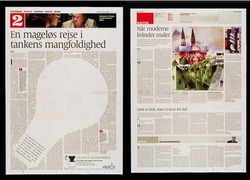
Typically, the grid should be a quieter influence, providing the underlying armature but not necessarily restricting every element to its strict borders. Graphic design provides thousands of examples daily. Magazine design elements erupt out of the page grid, pushing text out of the way to flow around rounded or jagged edges. Even newspapers, rigidly devoted to their column layouts, are frequent grid scofflaws whose design elements bust columns and gutters. The grid remains a strong foundation in these examples, but the design overflows its neat boxes.
Web design tends to be much boxier than most print work—and getting more so. Responsive web design nudges us to fall back to boxy layouts, organizing content blocks that rearrange themselves into new column grids for different screens. As a result, most modern designs mirror the rigid rectangles of their component parts. The design is the grid, and the grid is the design.

We could stand to loosen up.
As we become more confident in the techniques of these dynamically shifting columns, I’m optimistic that we’ll slowly return the grid to its proper role as background guide, rather than foreground design. For now, we’re still figuring out how to make responsive design work at all. Style and art direction will continue to emerge, and we’ll become more playful with our grids.
A proposed feature for CSS, exclusions, would help certainly help. Exclusions let you flow text around shapes, making it easier for web designers to adopt some of print’s grid-busting mojo, for example.
I also like my pal Luke Wroblewski’s experiments with off-canvas layouts which, while still grids, cleverly slide columns on and off screen for mobile devices. The effect is to turn a phone’s screen into a magnifying glass that focuses on one section of the grid at a time. The grid remains rigid, yes, but the user floats around it.
Exceptions Make the Design
Winking diversions from the grid elevate the best designs. In the case of New York City, that diversion is called Broadway. The famous boulevard slices diagonally across the grid (and in fact all of Manhattan). Originally an Indian path predating the arrival of Europeans, Broadway is one of the few pre-grid remnants allowed by the 19th-century commissioners.
The Great White Way gives character not only to the city’s map, but also to its street-level view. Broadway creates “bowtie” intersections that challenge architects to extend the intersection’s shape into the sky, into three dimensions. The canyon wall splinters in a moment of relief. Gorgeous.
Rules Are For Breaking

Right from the start, New York’s grid was always contentious, despised by legacy property owners and naturalists, too. The construction of Central Park in the 1860s created a new appetite to preserve what was left of Manhattan’s natural features. In 1867, opponents won a reform of the 1811 plan, making it bend more gracefully to the landscape of undeveloped areas north and west of the park.
As a result, New York’s Upper West Side respects the grid where appropriate, but often breaks ranks to allow streets and parks to curve along steep ridges (Riverside Park, Morningside Drive, Convent Avenue) or waver and wobble across the grid (St. Nicholas Avenue).
The 1867 plan broke the rules of the grid, but did it knowingly, carefully, to preserve a beauty more striking than rectangular order. All designers should be so wise in their work.
Grid systems should be respected but, when appropriate, flaunted. Like any guideline, grids are rules that exist to be broken.
That Goes for Interface Guidelines, Too
For those of us making mobile apps, we should bring a similar canniness to the interface guidelines of companies like Apple or Microsoft. Both companies have minutely detailed guides to what you should and should not do when building apps for their mobile platforms. In both cases, those guidelines helped establish a consistent design language across third-party apps. (The same can’t be said for Android, where guidelines were AWOL for several years, and the platform’s design practice grew in an ungoverned sprawl—New York without a grid.)
In the first years of iPhone apps, few developers strayed from Apple’s guidelines. Offbeat designs like the robot-themed apps from Tapbots went off the grid and were rightfully celebrated. Most app designers, however, hewed to the standard controls, widgets, and navigation systems that Apple provided out of the box.
Over time, designers and developers learn to bend rules. As the iOS developer community matures and grows more confident, we’ve seen corresponding experimentation with new design patterns, gestures, and navigation schemes. The iOS design language is flowering beyond Apple’s design guidelines. The babies are flying from the nest, and with great results.
This hasn’t happened yet with Windows Phone, a younger platform, but I suspect it will. My friend Marco Arment recently suggested that the rigid consistency of Metro app design is a potential weakness of the platform:
If designers create beautiful, rich, iOS-style Metro interfaces, they’ll look garish or out of place. And if they follow Metro’s lead instead, there’s a good chance that everything will look stark, bland, sterile, and undifferentiated.
Assuming neither approach can produce great, desirable designs that fit well on the platform and give designers the creative freedom and differentiation that they need, can Metro’s rigid design language accommodate a middle ground?
I’m more optimistic than Marco here. I believe that the design language will loosen over time, just like it has for iOS. If Windows Phone and Windows 8 are successful, the Metro look will evolve to include “non-standard” designs. That’s the way of things; creative people learn the rules and then build upon them. The first step, though, is to establish those rules. Successful platforms begin with consistency, a sturdy baseline.
The best designers know this: you’re allowed to break design rules as long as you actually know the rules and understand why you’re breaking them.
New York had to build its grid in order to learn the right way to depart from it.
Want More on New York’s Grid?
The exhibition’s catalog is chock full of documents, maps, and photos cataloging the progress of the grid as it crept up Manhattan. You can pick it up at Amazon: The Greatest Grid: The Master Plan of Manhattan, 1811–2011. Recommended.


