People Magazine launched a new mobile site last week, the first responsive website from Time Inc.’s 95 magazine titles. Check it out at m.people.com. I had the good fortune to lead the design effort and pull together some of the finest web talent on the planet (and also some of my favorite people).
The whole thing happened under the pragmatic (and genuinely gymnastic) direction of Time Inc.’s Tony Brancato, a great partner for us. And man, did we ever need the enormous brains of all these talented folks. Bringing a site as vast as People’s to the small screen conjures a slew of challenges and opportunities.
We developed some novel approaches that I want to share here. I’ll cover the site’s approaches to advertising, progressive enhancement, navigation, web interactions, full content across devices, and cross-screen community. First, though, here’s what we set out to do.
Our Mission
Our brief was to design a responsive site for phones and 7” tablets (Kindle Fire, Nexus 7, etc.). People has two other sites: one for desktop and one for iPad. The new edition stakes out the smaller end of the spectrum, replacing a very simple site that has served phones for several years. The new site’s responsive web design adapts to three primary breakpoints: the phone, 7” portrait, and 7” landscape.
The irony for this “small-screen” website is that its 7” landscape layout is nearly as wide as People’s desktop design. In creating this small-screen design, in other words, we also created a desktop-sized design, too. This is the essential nature of responsive design, of course, a layout that adapts gracefully to a wide range of screen sizes.
One of Three… For Now?
So why maintain three separate websites? Why not have a single responsive site and be done with it? I’m on record with a strong point of view that everyone should strive to have a single website that feeds the same content to all devices. That’s the ideal, at least, and I believe it should be the default starting point for any web project. Always ask, “Can we do this with a single site for all devices?” And if you can, you probably should.
But pragmatism is required here, and business realities leave little room for dogma. There are a whole slew of potential reasons why it can be tough to blow up your existing sites and replace them with a single responsive site—business reasons, technical reasons, organizational/political reasons, or simple risk management. Sometimes change can’t happen all at once.
But you can still get there one step at a time. People’s approach is a sensible one: build a mobile site using responsive techniques as a first step. Over time, you can overcome business/tech/org challenges to let your responsive mobile site grow up and eat the other sites. I don’t speak for People, and I don’t know if that’s their plan. But I hope so. This new site positions People to move eventually to a single responsive site, which would simplify their tech maintenance and editorial workflow. Word is, this new site will eat the iPad site next.
For now, though, this is a sturdy first step in the march to the promised land. You can’t always make the whole journey in a single leap, but you can still make steady progress toward the ideal. Eyes on the prize, friends.
(And hey, if all of this pans out as it should, perhaps it will boost People’s digital IQ, already in the top ten among magazines.)
The Whole Shebang
Unlike the previous mobile site, this new edition serves (nearly) all of the content of the desktop version, a frank acknowledgment that the mobile experience has to be more than a lite version of the “real” desktop website. We do everything on our phones now, and with more than just a quick glance. People’s stats bear that out, as People Digital’s general manager Liz White told paidContent, explaining why the old mobile site wasn’t cutting it:
“The initial version was us operating on the assumption that people were coming to the mobile phone to snack.” But when 25 percent of mobile users spend 5 minutes or more on the site, they’re coming for more than a quick snack.
Our job was to figure out how to wedge People’s vast store of content into the small screen without overwhelming readers. Here’s how we did it.
Progressive Disclosure
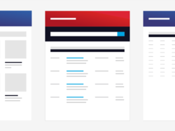
People.com offers a fast-flowing stream of daily content. The homepage’s job is to surface a ton of that content for quick, frequent scans of headlines and photos. On larger screens, we do that by displaying lots of links for the key sections, in typical news-website style. We show two columns for portrait and three for landscape.

Shrink the screen, though, and that giant collection of links suddenly becomes unwieldy. If you squeeze those links into a single column, you get an endless list of links, which is swipe-swipe-swipe frankly awful swipe-swipe if you just want a swipe-swipe-swipe summary of the swipe-swipe top news.
This is a common problem for mobile sites, and that’s where progressive disclosure is such a successful technique for small-screen interfaces. Progressive disclosure is a high-falutin’ term for showing only essential or summary information but making it dead easy to drill down into secondary screens or content panels when you want more.
On the homepage, we deployed carousels to do that work for phones. At the smallest breakpoint, the two or three columns of links collapse into a three-panel carousel. Only one panel of the carousel is visible at any moment, of course, so the initial display shows only the first one-third of links for each section. This approach lets you scan the latest headlines in every section with a quick vertical scroll, but you have the option to drill into a section’s secondary headlines by swiping horizontally through the carousel, or by using the arrow navigation.

Carousels require JavaScript to fire up their engines, of course, which means that phones without JavaScript (or operating systems like BlackBerry 4 whose JS is too awful to deal with) don’t get the carousels at all. That’s okay, because those browsers still get a link to the section homepages for access to that content. For less capable devices, in other words, progressive disclosure is managed by plain old web links.
We’ve been trained to believe that extra taps, clicks, or swipes or evil, and that’s not true. As long as every tap provides satisfaction (a completed task, more information, a smile), then it’s a quality tap. If the information scent is strong and if every tap is a quality tap, then it’s appropriate to require extra taps in the service of clarity on individual screens. Quality taps are more important than their quantity. This is true in all interfaces, but especially for mobile: Clarity trumps density.
Aggressive Enhancement
Since some devices can’t display carousels, we didn’t want to burden those devices with content that they don’t need. We deployed a strategy that Filament Group’s Scott Jehl rather awesomely calls aggressive enhancement. (Scott was a huge friend to this project, as was Mat Marquis and the rest of the gang at Filament Group.1)
If you’re a web developer, you’re already familiar with progressive enhancement, where you gradually layer new functionality into a site according to the capabilities of the browser or device. Aggressive enhancement goes further, treating content itself as an enhancement.
Know how Readability and Instapaper whittle a page down to its basic content? That’s what we did by design. Aggressive enhancement delivers a page containing only the most fundamental content, then fills in secondary content via Ajax. This approach works well for sidebars, “about us content,” some forms of secondary navigation—and in the case of the People website, the carousel content.
If a browser doesn’t have JavaScript, it doesn’t even download the secondary carousel content. The result is a light page that lets the browser start rendering that basic content right away. It’s a technique that’s respectful of visitors’ bandwidth, computing power, and time. It’s not only responsive, it’s responsible, one of Scott Jehl’s favorite phrases.
We also took extreme care (and a lot of lumps) to make the photo galleries accessible to all devices. Visit the gallery on a capable touch-enabled device, and you get a solid, fast, silky experience as you swipe through the entire photo gallery within a single page. The gallery is a full-screen experience, and you can tap to toggle the navigation controls, view photo captions, and reveal sharing options.
No JavaScript? No problem: less fancy browsers can still tap through all the photos, with each image loading in a separate page. In that case, the controls and captions get an appropriate inline display, without all the fancy toggling.

Backward Compatible = Forward Compatible
Why go through all this trouble to support underpowered devices? Many are older devices due to go out of rotation, right? First, supporting the largest possible audience is just plain good business sense. Doing otherwise leaves money on the table. More important, though, it’s a future-friendly strategy.
When it comes to the web, the more backward-compatible you are, the more forward-compatible you’re likely to be. It’s all too common to assume that the web’s future consists exclusively of ever more capable browsers on ever smarter devices. That’s part of the story, but the future will include dumber devices, too. Speech is coming on strong, for example, and the voice-driven web browsers in future automobiles probably won’t be JavaScript champs. Building sites that are gentle to less capable older browsers also paves the way for less capable future browsers, which may be more common than you think.
Content First, Navigation Last
Aggressive enhancement emphasizes essential content in the way it delivers pages over the wire. The same content-first values should apply to the design, too.
Mobile web experiences should lead with content, not a big stack of navigation controls. With time and screen real estate at a premium, mobile designs should fill the first screen of every page with the good stuff, with content.
At People.com, screen navigation is tucked behind a Sections button in the top toolbar. Tap the button and the entire screen fills instantly with navigation options. The menu’s appearance is instant and feels like an overlay has appeared, but in reality, it’s actually an anchor link to navigation at the bottom of the page.

This is my favorite navigation pattern for mobile websites, and it’s one championed by my pal Luke Wroblewski in his excellent book Mobile First:
This design uses a minimum amount of navigation elements (just a single link at the top), gives people an opportunity to pivot and explore when they get to the end of content, doesn’t duplicate the content of another menu, and (best of all) only requires a simple anchor link to work. That’s right: no fancy JavaScript, overlays, or separate navigation pages to maintain – just an anchor that links to the bottom of the page. That’s like HTML 0.
In larger layouts, we fall back to traditional desktop conventions and shift the navigation to a horizontal strip at the top of the page.
Make Way for Ads: Snap Banners
Delivering effective ads on mobile is just plain hard, and I’m not convinced that display ads will pan out as the future of mobile sponsorship.2 For the moment, though, banners remain at the center of things. Display ads are the revenue model, and publishers and advertisers are trying hard to find a way to make them work. It’s an uphill climb.
Traditional expectations continue to apply: advertisers want “above the fold” banner ads, but those usually choke out content or flick by so fast you don’t see them. Both the advertiser and the reader are poorly served. I came up with a new ad format to try to address this.
Snap banners hug the bottom of the screen in a fixed position but, as you scroll, they find a home and snap into a scrolling position on the page, eventually scrolling away like any other content.3 This new format stays on screen longer than a traditional inline ad, and the banner’s sudden leap into the scrolling page catches the eye, too. Those elements work to advertisers’ advantage. But the snap banner also stays out of readers’ way at screen bottom and then eventually gets clear of the screen entirely, both to readers’ advantage.

Even with the snap banner, though, tiny 320x50 mobile ads don’t carry much visual oomph. So we experimented with ads that expand to full screen. In addition to the snap banner delivery slot, we delivered responsive snap-banner templates that expand to full-screen on any device when you tap them, without taking you off the site. Tap again to dismiss.
We also serve occasional full-screen ads as interstitials in the photo galleries. In past user testing, I’ve seen high acceptance of ads in that context. Since you’re in gallery-flipping mode, it’s no problem to keep on trucking past the ad to the next slide. It’s like flipping through a paper magazine, but the format is bold enough that a reader will pause if interested.
Ads Are Hard
Aside from interaction challenges, ads remain a real challenge for responsive layouts. Most ads are still delivered as blocks of immovable pixels packed into into files with names ending in gif or png. Typically, you get one size of creative and that size is almost certainly defined by IAB standards.
We need more flexible ad creative: messages that are delivered in fluid html rather than static images. Ad agencies and networks need to step up here. It will open bigger opportunities for them, and unlock design freedom for publishers along the way. A well-crafted snippet of ad HTML can flow into any space it’s placed, adapt to any screen resolution, and target any device. Instead of juggling a ton of assets for a single campaign, you’ve got one tidy package. It’s better for everyone.4
We delivered some responsive, cross-platform ad templates as part of the design, and we’re hopeful that they yield useful discussions between People and its advertisers. This is a tough chicken-and-egg problem. Even with 1 billion page views a month (a billion!), People.com doesn’t have the individual weight to swing industry-wide change on ad formats. Unfortunately, agencies and networks show little interest in doing this on their own, despite the advantages. Someone has to budge. The best we can do is be noisy in our advocacy and generous with our examples. Meanwhile, we have to work around these inflexible ad units.
Typical banner ads jam the machinery of a responsive design. Responsive design relies on flexible elements: images, text, and other design elements that shrink and expand with the layout. Ads are rarely flexible. Shrink them down, and the text becomes unreadable. They are nearly always intended to be displayed at one size and one size only.
For now, that means ad-driven responsive designs have to build themselves around these immovable building blocks. When you build to IAB standard sizes, for example, the design favors the 320x240 ad block, since that’s the largest size that will squeeze inside most phone screens. In larger layouts, column widths are set to accommodate that same ad block. You see this in The Boston Globe’s design, and we did the same thing.
It’s not just a technical issue. It’s also a sales issue. “Separate creative for separate devices” is a reflection of the way these ads are sold. Mobile, tablet, and desktop versions of websites are presented as completely separate properties instead of simply “the website.” Trouble is, it’s people who form market segments, not devices. Segmenting by device—whether that’s for content or for advertising—just doesn’t reflect the way we consume information today.
We need to start selling sponsorship across platforms instead of in device silos. Responsive ads require responsive sales packages, too. My friend Mark Boulton has done some clever writing on this, and he boils it down to this:
Providing space for ads needs to be broadened into multiple spaces for one ad concept. This requires closer collaboration between advertisers and web sites, designers and marketeers and sales teams.
We’re still learning how to do all this stuff, and ad experimentation is needed on technical, business, and cultural fronts.
Photos Are Hard, Too
Photos are core content for People, and it was a real challenge to improve the presentation of photos—really feature them—while also remaining lean for mobile performance and compact for mobile display.
Tears, sweat, and blood have been spilled over the past several months over how to handle responsive images, serving varying image sizes or crops depending on screen size. (Chris Coyier, as usual, has a great roundup of the options.) For better or worse, we punted on this, and we serve the same image files to all devices.5
That decision was due to the nature of the source images available to us. People’s digital team does a ton of work with the photos, manually cropping and sizing each and every image that comes through. They typically generate over ten different versions of every photo. It’s a tremendous workflow.
People selected their cut sizes based on the needs of the desktop web layout, which is sensible since that’s almost exclusively where they’ve been displayed so far. But here’s the thing: those desktop-sized photos are too small for mobile—or at least, for retina-display screens. You read that right: too small for mobile.
Most photos on the desktop site max out at 435x580, smaller than the iPhone’s 640x960 screen, for example. (A jumbo photo size for iPad is also available for some photos, but not all.) Since we rarely had a high-resolution image available in the first place, we didn’t have to cope with the responsive-image issue, a mixed blessing. Unfortunately, that meant we weren’t able to serve People’s remarkable archive of photos in the best light for the growing population of high-res screens.
Responsive design is more than just front-end tech magic. It also requires hard changes to editorial workflow and content strategy. This stuff takes time. As high-density displays make the leap from handheld phones to desktops and laptops, revising our photo workflows will become an especially high priority. Lots of work ahead for all of us. (I’m grateful that Karen McGrane’s book is arriving this fall to help: Content Strategy for Mobile.)
Emoticomments
Another goal of the site was to knit together community on all platforms. People uses Disqus as its comment platform, so we wrestled their API into the new site’s design. But we also introduced a new element to the People ecosystem. I call them emoticomments.
Emoticomments are one-tap microcomments: they’re multiple-choice “Like” buttons, with emoticons as your options. They’re available on any photo or article, on all platforms. They’re a playful, effortless way for readers to share their reactions. Jenny Ng designed simple emoticomment icons to capture five essential emotional responses to People’s editorial.

People’s design crew replaced these with their own to make them consistent with the icons used on the desktop site.

Fast Progress for Responsive Design
Responsive web design is only a little over two years old. We’ve come a long way in that time, and every launch of a responsive design for a giant content site like this one is a marker of just how far. Responsive design is elegant and even simple in its theory, but sometimes devilishly complex in its details. Ethan has been barnstorming the country this year, sharing his techniques for overcoming some of the bumps and headaches that are inevitable with any new technique. We’re making headway. I’ve shared a few of our strategies for managing those bumps here, and all of it continues to evolve.
In any fresh technology or technique, the initial challenge is simply, “can we make this thing work?” Once you do, it’s time to add the polish. That’s the stage we’re at with responsive web design. As an industry, we’re moving at remarkable speed to improve the experience now that we’ve built the machinery. That’s happening not only in geeky areas of performance and optimization, but also in content strategy, workflow, and business strategy. I’m crazy proud of our team for some of the new techniques that bring that polish to People’s new site. Lots more great stuff ahead.
- We made much use of SouthStreet, Filament Group’s suite of tools for progressive enhancement. The code is open source, forward-thinking, and available for download via Github. (If you’re a web developer, get over there now. Run, don’t walk.) In particular, we used the Enhance, AjaxInclude and PictureFill libraries, and our prototype included the QuickConcat library, too. Scott and Mat were supremely generous with code and advice on the carousels, too, which were tricky devils to put together. ↩
- If you care about content, you should care about ads. It’s a civic responsibility for designers to help make content sponsorship work for mobile, whether through ads or some other strategy. Great content costs money, and figuring out how to pay for it on the desktop is already a mounting crisis. The problem is compounded in mobile, where click rates and sales rates for banner ads trail abysmally. The solution is likely to lie with sponsor messages that feel much more organic to both the design and the content of the site. This is something we experimented with in another project for People. Can’t say much about that now... ↩
-
Snap banners rely on
position:fixedto do their magic, but fixed positioning is poorly and inconsistently supported across mobile browsers. We had to revert to a browser whitelist provided by the jQuery Mobile team to detect whether the browser supports the feature. If not, the snap banner is delivered like a regular static banner at the very top of the page. ↩ -
These responsive approaches have to be crafted with more care than we’ve seen with rich-media ads to date. If you look at the JavaScript payload delivered by most rich-media ads, shield your eyes. The approaches are often a decade old, full of nested
document.write('declarations that block the page, slowing mobile display to a crawl. Ad agencies and networks badly need to audit their code (and let publishers audit it, too) to improve performance and be more respectful of the surrounding page. Wrestling with and accommodating third-party JavaScript was one of our biggest challenges on this project. ↩ - The design we delivered did use SouthStreet’s marvelous picturefill pattern to load certain homepage images only for larger layouts and to serve different thumbnail sizes at different breakpoints. That was dropped during implementation, and the same thumbnail images are served to all screen sizes. For my money, picturefill is the best way to tackle responsive images at the moment. ↩