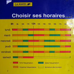
Outside my neighborhood post office, there’s a clever “choose your hours” sign, featuring a heat-map view of typical activity and wait times: red for busy, green for slow, orange for somewhere in between. Don’t come during the lunch hour; mid-afternoon visits between 3pm and 4pm are ideal.
There’s a lot of data in this humble grid. Every business hour of the entire week is represented. Since the details shown vary from day to day, it’s presumably based on actual, real-world data, rather than a finger-to-the-wind estimation (although it’s not clear how often, or even if, the sign is ever updated).
Of course, this information would be most useful to have before you go to the post office. Perfect for a website, right? Alas, looking up my post office on laposte.fr, I get only a simple listing of hours.
But what a great idea for the website of any organization or event where lines or crowds are typically involved: Museums, supermarkets, impromptu beaches, whatever.

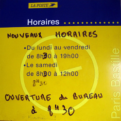
It’s certainly easier to keep this info up to date on the web than on a sign bolted to the side of a building. My post office proves the point. Just above this elegant little heat-map grid, we find another sign that lists the hours… recently updated.


