Best iPhone Apps: Reinventing (and Designing) Books in the Web Era
By
Josh Clark
Published Jul 29, 2009
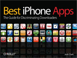
My latest book, Best iPhone Apps: The Guide for Discriminating Downloaders, hit bookshelves this week. I’m proud of it for lots of reasons—fun content, tight writing, colorful design, and a topic that’s at the bleeding edge of consumer computing. Most of all, though, it’s been especially exciting to be part of an experiment in publishing by my publisher, O’Reilly Media, in an effort that company chief and big thinker Tim O’Reilly has called Reinventing the Book in the Age of the Web.
O’Reilly (whether you’re talking about the man or his company) has always been uniquely forward thinking about the intersection of books and technology. And so, yes, O’Reilly Media distributes books online as PDFs, ebooks, and iPhone apps; it allows online access to its entire back catalog via the Safari Books Online program; and you can even read books right from their earliest drafts through the company’s Rough Cuts program.
But those innovations are all about format and distribution. The typically savvy thing about O’Reilly’s latest experiment with Best iPhone Apps and others is that we’re exploring how technology affects not only form but _content_—the way we read and tell stories. As Tim wrote in his “Reinventing the Book” post, the web has made episodic content comfortable and familiar; blogs, Wikipedia, and Twitter feed us brief dispatches that depart from traditional, long-form narrative. So when Tim and Sarah Milstein wrote their terrific bestseller The Twitter Book earlier this year, they purposely embraced this approach, even writing and designing the whole book in PowerPoint for its idea-per-slide format. Tim explains:
Now, you might ask, how is a book authored in powerpoint a web publishing experiment? It boggles the mind!
The web has changed the nature of how we read and learn. Most books still use the old model of a sustained narrative as their organizational principle. Here, we’ve used a web-like model of standalone pages, each of which can be read alone (or at most in a group of two or three), to impart key points, highlight interesting techniques or the best applications for a given task. Because the basics are so easy, there’s no need to repeat them, as so many technical books do. Instead, we can rely on the reader to provide (much of) the implicit narrative framework, and jump right to points that they might not have thought about.
Perhaps the biggest driver, though, was the need for speed. We couldn’t imagine writing a book about twitter that wouldn’t be immediately out of date, because there are so many new applications appearing daily, and the zeitgeist of twitter best practices is evolving equally quickly. So we needed a format that would be really easy to update. (Again, modular structure helps, since new pages can be inserted without any need to reflow the entire document.) We plan to update The Twitter Book with each new printing.
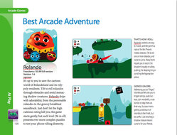
As Tim noted in a pair of tweets, my Best iPhone Apps book is very much modeled on The Twitter Book. Instead of a sustained narrative about getting the most from your iPhone, the book dedicates a page (sometimes two) to an individual app review. It’s a collection of bite-sized content appropriate to a collection of bite-sized mobile apps. Every page is its own self-contained tale, a review of a single iPhone app, complete with full-color graphics and screenshots wrapped in a gorgeous design (if I do say so myself).
I don’t mean to make this sound more grandiose than it is. Best iPhone Apps is essentially a catalog, a format that’s not itself anything new in publishing. Yet a catalog is distinctly web-like in its bite-sized, indexed approach to content. It’s a format that matches up with the way people consume content today. (Speaking of catalogs, the influential counter-culture Whole Earth Catalog is often credited as a conceptual forerunner of the web. However, the Whole Earth Software Catalog, a computer spin-off not entirely unlike Best iPhone Apps, was a business flop in the mid–1980s, an idea before its time—or more specifically, an idea before the web, an important element of what I hope will be my own book’s success.)
Keeping it fresh
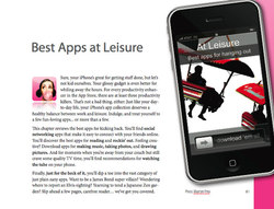
So a catalog-style presentation was a logical choice from an editorial perspective, but it also offers an important publishing advantage, too. This modular page-per-app approach means that the book is easily updatable (dropping in a new review is as easy as dropping in a new page), which likewise makes collaboration easy (other authors can contribute a page here and there). Moreover, modular content migrates easily to the web. Look no further than the book’s companion site, Best iPhone Apps, which trickles out a fresh review from the book every day, with content already perfectly suited to the web. The river flows both ways: I’ll be adding fresh reviews to the site which will, in turn, make their way back into the book with each new printing.
The iPhone landscape changes even faster than the twitterverse, with thousands of new apps appearing each month, a process that’s only accelerating. That means that updates to Best iPhone Apps, as with The Twitter Book, are necessary and inevitable. We’re still sorting out the schedule of these updates—it depends on how the book sells—but all of this means that the book is a living organism, both online and in print. It will evolve as the market of iPhone apps continues to evolve, a quarterly (for example) report on the state of the iPhone.
Some will poo-poo the physical book and prefer to stick with the free online version, following it as a daily resource or dipping in for a once-in-a-while search. That’s fine, and I hope people find the site to be a useful reference. But the book has its own special appeal. As Kathy Sierra is fond of saying, “atoms matter.” There are certain print-only benefits of portability, browseability, and giftability that only books can offer, and all of us enjoy the tactile pleasure of a physical object, especially a book as pretty book as this one. Even though the info is available online, there’s something irresistible about the atoms.
These factors mean that much of the project’s success turns on the book’s design—its appeal as an object, its modularity, and the ease and speed with which it can be updated to keep up with the torrent of iPhone apps arriving daily.
Author-friendly design
What made all of this especially exciting for me personally was that this is my first-ever outing as a book designer. I not only wrote the book but I also crafted the entire interior design—the layouts, illustrations, colors, and fonts. (I couldn’t have done it without the help and encouragement of O’Reilly legend Edie Freedman, creator of the O’Reilly animal covers, and can-do production editor Nellie McKesson.)
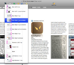
The project’s emphasis on speed and turnaround meant that it was important to work with a tool that was author-friendly, an environment that married content and design easily and without distraction. I naturally chose Pages, Apple’s excellent word processor and page-layout program. Pages is a terrific writing environment, with a combination of style and substance perfect for writing a book like Best iPhone Apps. The entire book was written and designed in Pages using a handful of page layouts, templates that are easily redeployed for new app reviews. Pages makes this easy by letting you capture page layouts and reuse them for new pages, dragging and dropping new screenshots and icons into place for each new app.

Not only do the layout and application make it easy to add new apps to the book, but I tried to create a bright, gem-like design that reflects the spirit of the iPhone interface, too. Each chapter has its own icon, reminiscent of an iPhone app; the design of sidebars is inspired by iPhone dialog boxes; quick tips are presented in speech bubbles like iPhone text messages; and the headline and caption font is Myriad Pro, Apple’s signature font.
In the end, it all came together in what I believe is a great combination of form and function. The book offers useful, timely content in an elegant wrapper that happens to be designed to keep it useful and timely. I hope readers enjoy the end result as I enjoyed putting it together. Check it out for yourself.


